The illustration I have chosen to work on first is the Little Mermaid, as this piece the furthest along and the most inspiring to me at the moment.
Castle Attempt One
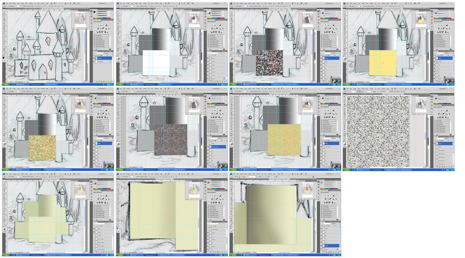
I have begun work on a new improved castle. The process started by creating blocks of greyscale shading. This will help to create a sense of depth underneath the colour/textures that I add on top. I am pleased with this part of the process, but am unconvinced by the textures and colours I have tried so far. I have decided to continue improving my image and return to this at a later stage, when I have more ideas how to create the texture I want.
Bushes Improvement

I have now moved on to creating a more density in the blue bushes. In the original mock up, this section was one bush scaled up; so, I am now duplicating the bush several times, layering them on top of each other and arranging them in a more realistic way. This will avoid stretching the pixels too far and maintain the shape of the leaves. In this process, I was also able to give each bush a slightly different shade, once again increasing the realism. I have created new pearl-like berries for the bush and placed them strategically throughout the composition. By erasing the sections that overlap leaves, I was able to create a sense of depth.
 |
| Completed Bushes |

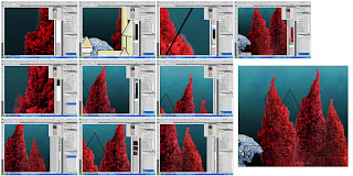
After completing the alterations to the trees, I zoomed out and realised that the edges were blurry. I decided to use the eraser tool and follow the shapes just inside the each image and create a more tree-like shape. By following the highlights and shadows, I was able to create an outline that wasn't blurry and a better sense of leaf shapes. I am now pleased with how this looks and am happy to move on.
Pathway

As the title of my project is "Pathways to Fairylands", I am trying to create a link between each image by giving the audience a pathway into each one. Therefore, I need to create a clear pathway in this piece. I began this process at the mock up stage by adding in some tower shells that will line the path; however, I need to re-photograph some shells to complete this, so for now I will create a sense of a walked pathway in the sand. I did this by using the paintbrush to draw wavy sand grooves. I then applied a shallow drop shadow and changed the layer settings until they created the impression of sand grooves. I am pleased with the look of these groove, however, they may need some alterations later.
Castle Attempt Two

 |
| Completed Walls |

I then applied the same techniques to create the towers. I used the gradient tool to create a smooth transition in the shadows.

No comments:
Post a Comment