I am continuing in my production of my first illustration.
Castle Alterations
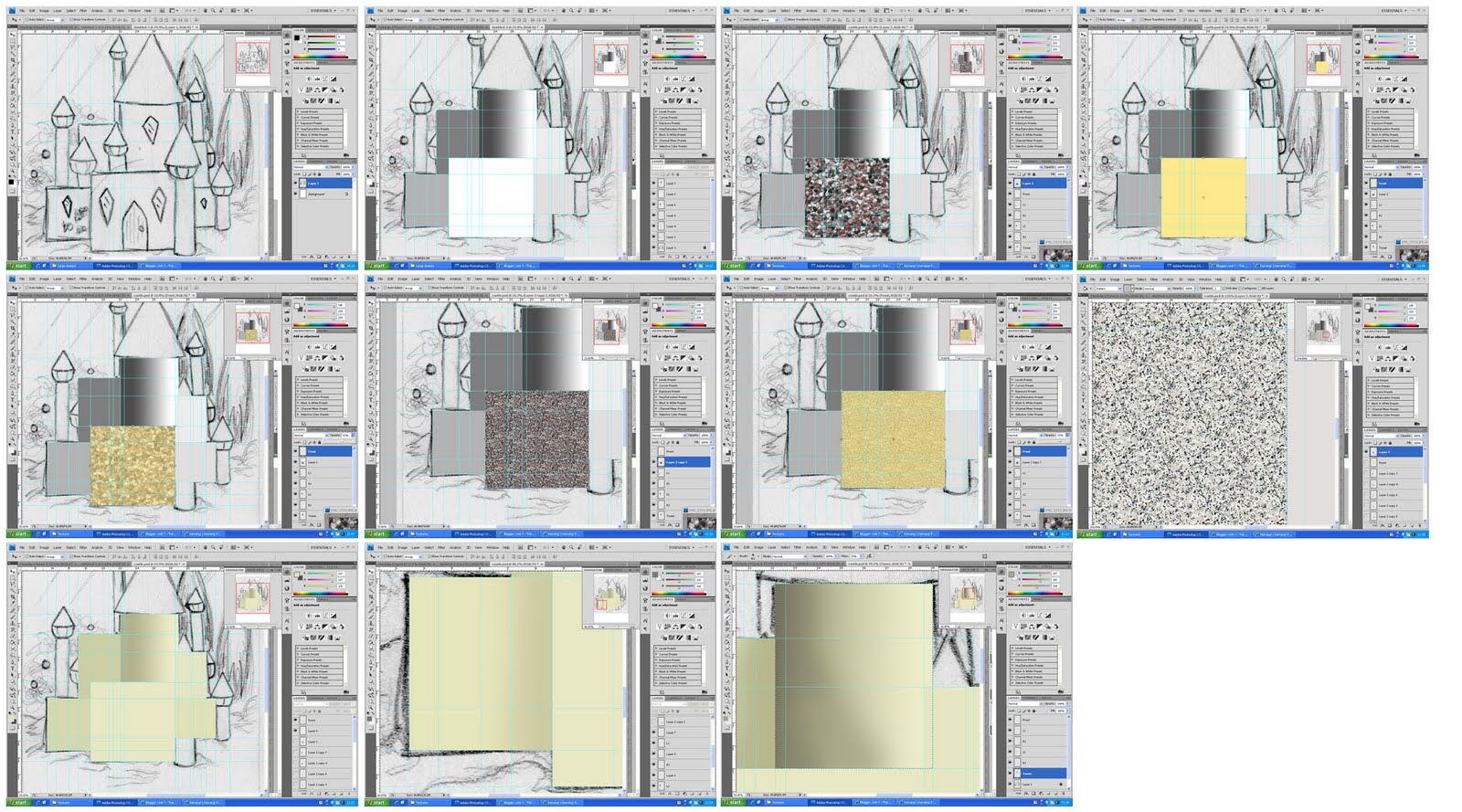
Upon reflection, I have realised that the layers of sand don't quite meet up with each other and so I can see white edges between the different walls. This isn't a problem at this stage, but when I come to scale up the image for printing, these gaps will become bigger and more visible. Therefore, I have solved the problem now by creating one layer for the sand and expending its selection by 1 pixel. This has successfully created no joins and no white slivers.
Shell Door Attempt
I had an idea to use a clam shell as the door to the castle, as it wouls link together the whole sea theme. using the selction tool, I created a layer for the shell and placed in position as the door. However, I am unsure how successful this has been. I am going to continue my development and try other things.
Tower Pods
Using the shading techniques I discovered earlier, I created a shape for the pods. I then took a crop of the opalescent inside of a shell and applied it to each pod. I like the effect of the mixture of colours, and it works within the underwater theme.
However upon reflection, I am unhappy with the overall shape of the pods, and have decided to create a slightly altered version. The new version has straighter sides and a flatter bottom. This will help to create a more 3-dimentional effect. I then put the opalescent colour back on top of these new shapes to complete the look.
Tower Tops
Whilst trying to stick to the underwater theme, I have experimented briefly with the tower tops by cutting a swirly section from a photograph of a tower shell. When lined up with the edges of the pod the swirl looks like it could be the roof; however, I don't think this is effective as the shell blurs easily and has the wrong shadows, which would be very difficult to edit effectively. In light of this I have applied the sand texture to the roof tops, as this fits in with the rest of the castle and can be manipulated as required.
I have also experimented with the main tower in the castle's structure. The shell section was cut from a conch-like shell, which I shaped to fit the top of the structure. However, there is the same problem as before in terms of shadows, but also I don't think it fits with the rest of the composition. Therefore, I will leave the sand texture as it surface.
I then spent time altering the shadows on the various elements of castle's structure. This was made easy by the greyscale layers I made earlier as they are still separate from the sand textures, and so can be altered as much as necessary.
 |
| Completed Castle |
Door Creation
As the shell didn't work out as a door, I have returned to my original idea of creating a wooden door. So, I began by creating the shape I want and filling it in with a light-ish brown. I then got a photograph of wood and experimented with the layer settings to find the most effective in creating a texture - I decided on Multiply.
I also experimented with the darkness of brown, burt decided I liked it as it was.
Door Knocker
Instead of using the clam shell as a door, I have made it smaller and applied it as a door knocker. This is an example of the, hopefully, intriguing details that will interest my audience.
Windows
In the original story the windows are described as being made of amber, and so I have used a mixture of gradient tools and pattern rendering to create the effect of sheets of amber for windows. I used a pillow emboss to make the window look like it has been pressed into the sand. This is surprisingly effective, and I have now applied it to the door and the door knocker.
 |
| Completed Castle |
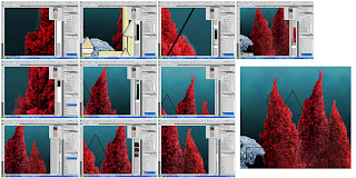
Seaweed Development
I used the pen tool to follow the seaweed shapes I drew on my designs, which I then filled in with various shades of green. I am pleased with the shape of each example of the plant, as it has the characteristics known to seaweed - i.e. varying thicknesses and unusually blobby tendrils.
As these still look quite flat, I began adding another shade of green to the centre of each of the plants. I did this by selecting the plant, then contracting and feathering that selection. I then picked a lighter or darker shade and painted that into the selected area. This created a smooth transition between each shade and a better sense of depth.
To increase this sense of depth I added an emboss filter to each layer. This has created highlights and shadows on each piece. The transition is clear below.
Mermaid-Shaped Fish Shoal
By creating the outline of a mermaid, I will be able to create the same shape out of individual fish. I have downloaded a brush with a variety of fish, and I have chosen one of those, which I will duplicate and move around to fill the mermaid shape. This is another example of curiosities that I hope will intrigue my audience. By changing the angle and size of each of the fish a little bit, they will each look individual. I will be sure to make the shoal look quite thick, but it will be important to leave some blank areas, as this will maintain a sense of definition amongst the fish. After applying all 300 fish, the mermaid has taken shape. I am pleased with this element of my image, as I was unsure how I would create it, but it has turned out well.
Above shows how I have experimented with different shades for the mermaid. However, as I want it to be quite subtle, I will stick to the original colour as it matches well with the background.