Sunday, 19 June 2011

Development of Doors/Cupboards

A few weeks ago, I designed a set of doors and cupboards that I would need to present my work in the exhibition. See sketchbook for designs.

As the doors are now nearly compete, I have been testing the best tecnique for staining. I wanted to make the wood fairly dark and look quite worn. I have been using a stain called Jacobian Dark Oak. As the doors are made from MDF, they have no texture, so I plan on using sand paper to create a range of grooves in the wood, which is a technique I have tested. I have also hit a problem with the smaller cupboard structures, as the wood they are made from has a coat of white paint on the surface. This stops the stain working as it should, so I will experimenting with techniques in order to create a darkened, textured look.
I began staining my doors using a soft rag creating a smooth application of stain; however, my technique changed once I got to the small cupboards. At this point I began using a brush, as it applied much faster, thicker and created the effect of wood grain over the thick white paint. This was very useful and continued with this technique on my larger doors. This means that most of my doors are quite different from one another. Although this may seem like a downside, I am happy with the outcome because it gives each one a little bit of individuality.

The large doors are also very different from each other. After completing one door, I began using a new can of stain, which turned out to be a lot darker than the original. This was initially very problematic, as it was also much harder to spread and dried quite patchy. Fortunately, there are two doors darker than the others. This has allowed me to balance the layout on the wall, by putting the lighter one in the centre.

Wednesday, 15 June 2011

Review

Above are the three illustrations I have created: Inchelina, Rapunzel and the Little Mermaid. I am pleased the outcome, but I want to check if they need any alterations before sending them to the printers. I feel that the shadows on the tower in Rapunzel need to be darker; the shape has become a little flat due to incorrect lighting. I have also created softer the edges to the pathway in the Little Mermaid. These changes can be seen below.
Although I am pleased with these images, I am going to print them out to check the colour balance. This will also give me opportunity to deeply study the images for any defects that can be fixed before being sent to the printers.

Rapunzel Creation Two

Change of Composition
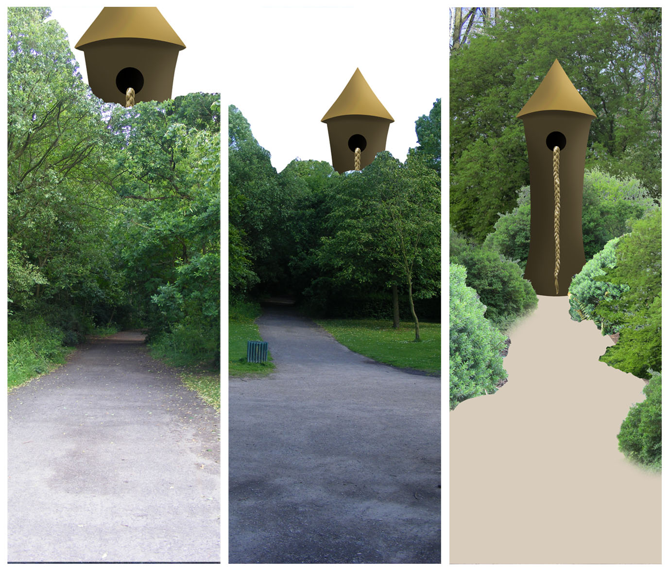
Above are is the original image I was working on, followed by two new background images. I have realised that surrounding the tower with trees and very inefficient and ineffective. Therefore, I have decided to change my compositional pathway, ad work into the right-hand image. The field provides surrounding greenery and a sense of isolation that is created in the narrative. Also, it won't require much manipulation in order to achieve the standard I am after; therefore, making up for time I lost on the bushes in the previous composition.

New Composition Alterations
As the trees are quite short in this section of the background photograph, I have duplicated the layer and shifted it to the right. This has brought over more trees, which I have layered over the top. Using the clone tool, I was able to layer a grassy patch over the path, making sure all the elements sit well together. I then experimented with creating a thunderous sky, to represent the evil witch's hold over Rapunzel. However, it didn't seem to work. Finally, I added horse footprints into the gravel of the path. This represents the prince that came to visit Rapunzel and saved her from the evil sorceress.

Shadows
As the tower structure is complete, I have added its shadow into the composition. This was done by duplicating the layer and painting the entire section black. I then Warped it so it was flat and elongated; to alter the colour, I reduced the Opacity and added a Gaussian Blur. This created a fuzzy edge, as the shadow wouldn't have a sharp edge due to its distance from the tower itself. I had to create another grassy section to layer over the shadow, to create continuity in the depth. I also altered the size and shape of some of the hoof prints, as they seemed to be in illogically straight lines.
Comparing Compositions
As I have had a change of course, I am looking at the two images to make sure I have made the right choice. Although the first design has more sections and is perhaps more interesting, I think the second is the most appropriate as it is more realistic and truer to the story. I think the fact that the new image has fewer elements allows the whole piece to work better together, as there are fewer sections to clash and, therefore, spoil the image as a whole. The perspective is also much easier to understand in the new piece. Therefore, I am convinced I have made the right decision in changing the composition to the open field instead of the enclosed forest. I had spent long enough on the original to be sure that it wasn't working and wasn't going to get any better. I am pleased with my last illustration, and plan on comparing all three to assess the need for alterations.

Sunday, 12 June 2011

Rapunzel Creation

As I have decided to stick to my original composition plan, I will now begin creative the piece.
Tower
I have applied similar techniques to the tower as I did to the castle in the Little Mermaid, as I found it to be very successful. I traced the tower's shape from the mock-up image and created a grey scale version of the structure, this will create smooth transitions between shadows and highlights. This was then layered over with a plain brown and some brickwork. The same process was used to create the rooftop; only instead of brickwork, I created a linear gradient to create the effect of straw or shingles.
I have then added a window into the side of the tower; this is where the braid of hair will hang from. I decided against the circular hole I had originally designed, and replaced it with an arch-shape. I think this is much more appropriate and suited to the structure. I have created a range of shadows with an ochre highlight inside the hole; this could represent a lit candle.
Completed Tower

Creating the Plait
(http://vector.tutsplus.com/tutorials/illustration/how-to-create-a-hair-braid-pattern-brush-in-illustrator/)
In order to create a realistic looking plait, I have decided to follow the above online tutorial that will take me through the process of making a brush in the shape of a plait.
I found this tutorial very interesting, as I have never made my own brush before. The design was simple to create and I enjoyed the process. However, I did find it difficult to actually save it as a brush. I did manage to, but couldn't open it in Photoshop, as were my intentions. However, I was able to get around this by transferring my tower to Illustrator, drawing the plait to the right length and shape and transferring them back into Photoshop.
Once the plait was in Photoshop, I was able to alter the colour to my requirements. I have added a red bow to the plaits end, as it is often a symbol of innocence, which is very much a common theme in fairy tales.

Pathway
I have added some texture to the existing path, by using Filter>Render>Clouds and adding some Noise. This has created a gravel effect, which I think is appropriate for a pathway.

Trees
I have begun working on the surrounding forest, starting with the background. I have taken two separate forest photographs, layered them together and merged them in a way that creates a dense atmosphere. I think it is important to create a dark scene in this image, as the forest would be very thick and over grown. This is why I have also altered the Brightness/Contrast settings on these images, as this darkened the scene and got rid of the blue sky and sunlight that was too obvious on the leaves. I have begun to add tree trunks and grass to the edge of the pathway, as this is how it would be in nature.

Size
At this stage, I am beginning to be concerned with the scale of the tower. I seem to have hit a dilemma in the perspective I am creating. While the tower is surrounded by trees, it looks very small; but when the size is increased, the sense of depth is lost. I have decided to go ahead with the centre scale, as it seems to be a good balance between the other two.

Bushes
I am now beginning work on the brushes that line the path. I wanted to add bushes as it would help to fill the composition and create a denser atmosphere. However, they are becoming a major problem. They are very time consuming to clean up, but still look very out of place at the end of it! I am also now becoming aware of time constraints, and am concerned that if I continue on this path i will not finish on time or will have an image that isn't as effective as I was hoping. I have decided to consider other compositions and surrounding scenery.

Rapunzel Layout Variations

I am trying out a couple of different compositional layouts before I begin into the major development work on the illustration.
The right image is my original composition, and my only problem with it is that that the trees in the background reduce the scale of the tower. This alters the perspective of the entire composition and creates an unusual optical illusion, which I don't want in my piece. However, this might now be solved by replacing these trees with some from my new research.

The other two images are new designs that I was inspired to create whilst on my research trip. I thought it might be more correct in terms of scale if the large castle was sticking out of the top of the tree tops instead of being contained within the trees of the forest. However, this leaves the rest of the composition quite empty and, therefore, uninteresting to the viewer. This became clear to me after creating the above mock-ups. In conclusion to this, I am going to continue on with my original composition.

New Research

When I came to look at the resources I had to create this last illustration, I realised that all of the trees had no leaves. This left the composition very empty, and it didn't look like a dense forest. These are the new set of photographs I have taken, now that we are into summer the trees have more leaves and appear a lot thicker than previously.
Inside the Woods, with path
Wider Composition
I am much happier with these images, as they will fill out my composition nicely. There may be some trouble with the highlights and shadows depending which image I use together. This is due to the fact that the sun was in and out therefore making inconsistant shadows throughout my entire research. However, this can be solves using a variety of tools on Photoshop, including brightness/contrast and the dodge tool.


Whilst I was gathering this research, I had an idea that could improve the design of my composition. I plan to briefly experiment with this idea at the start of the development.

Friday, 10 June 2011

Rapunzel Illustration

This is now my final illustration and I hope to have this completed by our first deadline, Wed 15th.

It is a while since I have seen the mock-up for this illustration, and I have now realised that I will need to re-photograph the trees. The trees I have are quite bare, and I need lots of leaves on the branches in order to help build a sense of dense forest. I plan on getting these photographs at the weekend, so in the meantime, I will work on what I can an address the problem over the weekend.