Sunday 26 June 2011

Final Evaluation

Looking back at my project and comparing it with my initial project proposal, I realise that the outcome has changed little from what I aimed for at the start. Although the stories I chose to illustrate were different to the ones I originally suggested, I realise that these were only ideas at the very start of the project and were always likely to change in the early stages and they have benefitted the understanding and interest in my work. The final presentation of the project has also changed, by increasing the amount of doorways and adding relevant images and objects behind them. This was suggested during a critique, I decided to look further into this idea, and I am glad I did as it has now created a much more interesting and enjoyable exhibition.
During this project, I used a variety of digital techniques and skills, in both photo manipulation and digital painting, to help me to successfully build my images. As I have already used the computer programmes for several projects, I felt comfortable using Adobe Photoshop and Illustrator to help me to create the scenes and imagery I wanted. I also feel the physical materials I chose to use in the final part of my project were particularly effective. I used different types of wood to build the doors and cupboards for my exhibition, which are sturdy in their structure and aid the concept I was aiming for.
As an art student, I believe that all projects could benefit from additional research; there is always another route that could be explored. Personally, I could have looked further into three dimensional imaging techniques, as I was very interested in creating some 3D scenes. I began to explore this area briefly, but found it very difficult to replicate the results, and so I felt it would be more worthwhile to stay on track as I was becoming aware of looming deadlines. This additional secondary research could have taken me down a very different route, but I am glad I stayed on track and stuck to my original intentions.
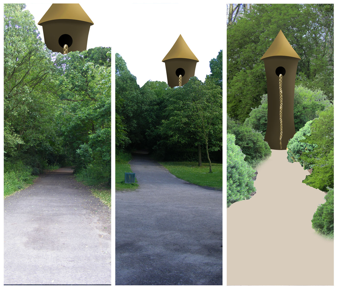
At several points in this project, I was very aware of time constraints, which definitely had an impact on the work I produced. The main thing I would have improved on if I’d have had more time was to better develop some of the illustrations I created; in particular, the large Rapunzel illustration. In the end I felt that this piece was a little rushed and I spent less time on this image than the other two. However, this is understandable because there were fewer elements in that piece than the rest. I might also have spent longer adding more subtle elements to each illustration. During the first few weeks, I thought about adding subtle images within each piece that would symbolise events/characters in the stories. However, time constraints made me focus on each image as a whole, rather than individual additional elements. But, I think this could have improved my illustrations and made them more intricate and interesting to my audience.
When I started this project, I already had a wide range of digital imaging techniques that I was prepared to use and build upon. I feel I have definitely improved these skills and learnt some new techniques along the way. I now feel well prepared for any digital imaging task that could be set for me. When the project began, I set myself a challenge to use an online blog to record my progress instead of a sketchbook. As I had only briefly used a blog twice before for Media Studies coursework, I felt it would be quite a challenge and a learning curve, and it was. But I soon learnt how to make it suit my needs and am now well trained at it. I did realise, however, that the blog was not suitable for my Reflective Journal. I had been “Labelling” posts as Reflective Journal, which could then be viewed all together. But after a while, I realised that the reflective parts weren’t as clear as I would like them to be. So I began putting my reflections in a Word document, which suited its needs much better and was a lot clearer.
Looking back at my completed project, I am pleased to say that the outcomes have definitely been successful. I believe this because I have completed every objective that I set myself, the exhibition looks impressive and it has all been done within the deadlines. I have followed every avenue I could to allow my project to grow and develop and my tutors and peers have given my nothing but positive feedback. However, the most defining factor in this decision is that the digital illustrations I have created are both realistic and interesting and fit into the context I had originally planned for them. I now believe that my intended audience is children, which was not a conscious decision, but I realise that they project is better suited to the interest of children, due to the fairy tale subject-base and the way I have presented my work. I think the doors and cupboards will be of great excitement for children ages between 3 and 11, as they will be able to relate to the stories and be excited by the intrigue of the doors and the bright colours behind them. I think there is also a sense of the magical in my illustrations that will definitely appeal to this younger audience.

Saturday 25 June 2011

Digital Jars Behind Doors and Final Exhibition Space

Now that all of my digital jars are complete, I have have put them in position in my doorways.
I am pleased with the images in their proper context, as I think the illusion works; they look like the door has been opened on a a real cupboard, which is the effect I was hoping to create.
Above are images of the final layout and completed exhibition space for my project. I am very pleased with the final outcome of this project. The only concern I now have is that the visitors to the exhibition will be too shy/hesitant to open the doors and look inside. However, I am glad to see that passers by in the department have been curious enough to open the doors, and hopefully this will be similar in the outside visitors. Also, some of the doors swing open slightly on their own, allowings veiwers to peer inside. This will make them realise that there is something behind the doors and they should be opened.

Thursday 23 June 2011

Digital Jars Continued

Now that my exhibition space is nearing completion, I can return to the last of my digital jar creations. I also have some new ideas. See Sketchbook. These images have not needed any further research, as I learnt everything I need from the Jars research earlier.

Swallow Jar
As I don't have access to a swallow, I have used the internet to gain a good image suitable for my needs. This piece is going to be quite simple, but will be effective for it. I have traced the shape of the jars and filled it in with sky blue. I then used Filter>Render>Clouds and erazed to create a couple of patches of clouds. This adds to the sky effect, making it more realistic. I then positioned the bird as I wanted it and adjusted the settings to make it a little bit more rounded and fuller in shape. The final step was to add the highlights of the jar back over the top of the inside image, which is something I have been doing to all of my jar images. This is a very important step, as it creates the illusion of the glass at the front of the jar making the object look to be inside the jar, rather than stuck over the front.
Above is the final image that represents the Inchelina story. It shows the Swallow that she saved from the Mole's tunnel, and who in turn saved Inchelina from marrying the Mole. He is a very important character, who has great influence on the plot. I considered representing the Swallow with a feather, but felt that was too vague and would be difficult to put into some kind of location. So I decided to go with the actual Swallow flying thought the air, as he does in the narrative.

Wall Jar
This is the simplest jar I am going to make, and I wish there was a more interesting image I could create to represent the rest of the Rapunzel story, but it isn't a long tale and has few characters and events. Once again, I used secondary sources to gain the image I required to make this image. I have edited it to create greater contrast in the colours, and have made sure it sits well inside the jar without looking out of place.
Above is the last image I needed to make for this project. It represents the wall that separates Rapunzel's parents from the garden of the evil sorceress. It is very simple, and I fear quite dull/boring, but I have made it may own by creating a dark atmosphere and putting in the right context, i.e. in a jar. There were few other options for images to represent this story, but if I'd have had more time I might have been able to find something more appropriate. However, I am currently happy with this outcome at this late stage in the project.

Before I mount these jar images in their frames, I am going to do a test print to check the colours. I will also check the detail in each piece to make sure there are no obvious mistakes. I haves realised that all of these images are quite dominated by blue. However, this is something that would be very difficult to get away from seen as two of my pieces are underwater scenes. But I am happy with them, because they will be spread out throughout my presentation, not bunched together. Also none of my other illustrations are particularly dominated by blue, except perhaps for the Little Mermaid, which actually doesn't strike me as overly blue.

Jars in Cupboards

Now that my cupbaords are up and my main illustrations are in place, I am beginning to work on my jars. I have done several designs for each of these ideas, please see sketchbook.
Rapunzel               Little Mermaid            Ichelina
The first two jars are for Rapunzel. The first is a collection of seeds, grain and some potpourri. These represent the herbs the sorceress was growing, and the father was stealing at the start of the narrative. The second jar is a pair of scissors surrounded by thorny ivy. This represents the scissors used to cut off Rapunzel's hair and the thorns that poked out the Prince's eyes at the end of story. I felt it was important to represent both of these parts of the story, as they are often not known about. The third jar along is for the Little Mermaid, it is filled with sand and a variety of sea shells that are described in the narrative. The last jar is for Inchelina and contains a thimble sitting on a pebble surrounded by ivy. This symbolises the tiny person in the story and shows how big things would seem to her; I think this links to the main illustration very well, as it also has a similar representation of scale.

There are two more jars that have required more work, which I have documented.
Little Mermaid Jar
I began first by making the pitchfork, as this is quite simple and will allow me to get used to the material before it gets complicated. I began with a  simple structure made from twisted thick silver wire, and added some thick red wire as the structure of rubies. I then used a thinner purple/reddish wire and wrapped it around the red structure. This built up into a 3-dimensional jewel at the top of the prongs. I then used a thin gold wire to thicken the silver structure and add a royal theme. I am pleased with the outcome of this piece and am prepared to move on to building the crown.
I have begun the crown with the silver wire and made a strong ring. I then created a series of peaks, which I then attached to the ring to make the many tips of the crown. I then made another ring for the bottom and 5 diamond shapes. I then attached all of these together the make the basic structure of my crown. However, I then realised that I had made the diamonds out of the thinner wire and would not be strong enough to maintain their shape and the wrapping process.
So I disassembled the lower section of my crown and decided to rearrange the design. I reattached the bottom ring and began filling in the lower part with gold wire, I would then add the jewels to the tips. However, I soon realised that the gold was not working. It looked messy and was squashing the structure. It no longer looked like a crown and I didn't want this creation in my exhibition, it was ugly and harsh. So I set about making a completely new design, which was much simpler and more relevant to the pitchfork. See below.
This jar is now complete, and I am happy with the composition. I wanted to create a symbol for the mermaids and the mer-king, as it is very important that the mermaids come across in the illustration; otherwise I don't think the audience will make the connection and work out which story is being represented. I chose the crown and pitchfork/staff because this is something I always picture and associate with the king of the mermaids; and I think it represents fairy tale royalty well.

Inchelina Jar
I am now working on my final jar, the white butterfly from Inchelina that the girl tied a ribbon to to be pulled down stream.
I have bought a wire butterfly from a craft shop and am looking to attach a white ribbon to it using wire. The wire will help me to shape the ribbon inside the jar, rather than it just flopping straight down. This will help to create a sense of movement. I used a glue gun to stick the wire to the ribbon, which I folded in half to cover the wire. I then stuck this to the back of the butterfly and the piece was complete.

Above is the piece in position. I was going to have the butterfly inside the jar, but I realised that the cupboard was quite a lot taller than I needed it to be and so I decided to hang the butterfly from the roof of the cupboard. This created the illusion that it was escaping form the jar. I like this touch as it adds movement and a little character to the piece. Also when the door is opened the butterfly will most likely shudder a littler creating a better sense of life.

All of my jars are now complete and I can continue work on my digital designs.

Wednesday 22 June 2011

Completed Doors, Layouts and Images in Doors

Below are images of my final layout of doors and cupboards mounted up on the wall. I based this layout on one of the design sketches I produced, while experimenting with layout.
I am very pleased with how the wall looks, and am glad I decided to create a range of smaller doors, as these have added more interest to the wall and filled in lots of the white space. As I said in a previous post, I was able to balance the layout of my doors, in terms of difference in colour due to the staining. This was very important, as the difference is now unnoticeable; whereas if the outcome had been different it may have spoilt the overall look. However, the layout is exactly how I imagined and I am excited to begin adding my image to the doors.
Above are my final images in position behind the large doors. The prints I ordered are of good quality, and I pieced them together very easily. Unfortunately, I made some measurements wrong and have had to reduce each one 11cm in height before being able to fit them into the frames. This was disappointing, but I was tactical in what I cut off and was sure to leave the important elements. I have also had to leave an extra bit of white (5mm) on one long side, as it turned out to be a little too thin. However, I have been able to hide this away behind the hinge of the doors and they are barely noticeable.

After solving this problem, I was then faced with another; how to put the large images behind the frames. Originally, I had thought about mounting the images the wall and putting the frames over the top. But I soon realised that this was not a good idea, as wood stain was likely to rub off on the images (leaving ugly brown marks) or the drill/screwdriver could tear the paper. Neither of these outcomes was appealing. So, I had the doors mounted first. I considered sliding the images underneath the frames, creating a nice overlap and neat edges. However, after some testing on a smaller door, I realised that this could have the same affects as the previous plan, i.e. spoil the prints. It was at this point, I decided the best was would be to cut the images the exactly the size of the inside of the frame and hang them with pins at the edges. This is the technique I used. It was very effective, and I was able to hang them in place with minimal damage to the prints. I will also be able to remove them with further damage. However, this process took longer than I thought, and now feel a little behind on other sections of my project.

Monday 20 June 2011

Jar Images

Now, I am starting to create the digital jar images, starting with a brief layout and positioning of the jars.
Shipwreck Jar
During the development of this project and the previous one, I have now had plenty of experience in making underwater scenes, so I knew exactly where to start. I began with a light to dark blue gradient and added a Noise gradient over the top. This creates a sense of depth at the bottom and light rays through the water. I experimented with a whirl-pool surface, but felt it was inappropriate for the design of the jar.
To make reflections on the bottom, I used Filter>Render>Clouds and applied Colour Dodge to the layer properties. This blends in the dark and creates highlights. I then began editing the boat image I got from secondary sources. Firstly, I used the magic wand tool to select the boat. This cut out some of the sails, but this has a positive effect on the image. A shipwrecked ship wouldn't have sails; they would have rotted away, so I am glad that the selection tool I used left me with just the masts. I experimented with several layer property settings before I chose the ones I did. I decided on Multiply because it created a ghostly effect, by reducing the opacity of the lighter sections and making the darker sections darker. I also decided to break the ship up into different sections. This allowed me to layer the two different sections over one another to create a denser look and the impression of a more violent incident.
I am very pleased with the final look of this image. I think it is very effective and has the right atmosphere to get across the abandonment of shipwrecks. I think this is due to lack of sea creatures and the darkness of the water. I felt it was important to put this image in my series as the legend of Mermaids tells tales of them luring ships onto the rocks. Although this isn't how the story is told in the fairytale, it is mentioned several times and there seems to be a sadness in the characters when it happens.
Fish Jar
Moving on the second Little Mermaid jar, I began in the same way as the previous to make the general blue background and rays of light. I then used a brush I downloaded earlier to help create the fish shoal in the full illustration, which contains lots of different examples of fish and sea creatures. I used these as a basis, added colour and adjusted them in various ways to create deep-water life.
By adding some blue to the glass of the lid, I have created a more realistic representation of water inside a jar, as it would be reflected in the top to an extent. I also felt the bottom of the jar wasn't dark enough to give a good impression on dense water, so I adjusted the gradient to make a darker bottom.
Above is the final image for the second digital jar I am making. I am unsure how realistic it looks in terms of the creatures, but this is the best I could do with the time I have and the resources i he access to. If I had more time, I am sure I would have done more research into this idea, which would have improved my image greatly. However, I am happy with the overall look, as in my exhibition there will be plenty more to see besides this image.


These jars are now complete; however, there are still two to complete. I am currently struggling for ideas for these two jars and so I am going to spend the next few days working on my presentation and, hopefully, gain some inspiration.

Sunday 19 June 2011

Digital Jars Research

In my last project I worked on a concept that involved creating dream-like scenes within jars. Due to this, I carried out research into different types of jars, and this helped me when creating my own.
Specimen Jars - Manchester Museum
My first set of jar research was specimen jars. I visited the Manchester Museum, where there was a range of jars throughout the building containing various objects and creatures. The most interesting of these were the sea creatures, because they had interesting patterns that were being distorted by the liquid and the glass. Unfortunately, a lot of the photographs were of a low quality due to the lighting and the many layers of glass. This caused the camera not to focus properly and created blurry images. However, I enjoyed gaining this research and think it helped me to create accurate images in my last project, as I could see how the glass distorts the objects inside. I then applied this knowledge to my creative process.
Sweet Shop Jars - Warwick
Also during my last project, I happened to take a trip to Warwick and walked past this sweet shop. I photographed the jars in the window for study and found them to be just as useful as the specimen jars, and a little cheerier. These jars were very interesting for their light reflection; being in the front window of the shop, they had lots of light being captured on the curves of the glass. Once again, I applied this experience to my design process and made sure to incorporate it in my images to make them realistic.
After conducting research and carrying out some design sketches, I set up two shelves with a variety of jars that I had collected and photographed them in various layouts. I used one of these photographs as the background of my last piece and filled in each jar with digital images, both manipulated photographs and digital paintings, to create the captured dreams. I am still very happy with the outcome of this project, and am glad to be able to apply the skills I learnt to my final major project.
Secondary Research
Underwater Shipwrecks
As I am going to create images inside my jars from scratch, I need to conduct some research into how the scenes look in the real world. As I don't have access to a shipwreck or tropical waters, I have turned to the internet. The shipwreck images are very interesting to study, as the shapes of the various pieces of the boats have become twisted and distorted. Also the compositions are very blue, with an unusual change in light. I will be sure to bare this in mind when making this image for myself.
Tropical Fish Scene
The final image I can research for is the fish scene. I am unsure if I will be able to create an image as dense with fish as this, but I will have to see what I can do. I like all the bright colours in these images, and hope to create something similar for myself.

The other scenes I am going to make need more consideration, but I will carry out the necessary research before I begin working on them.

Development of Doors/Cupboards

A few weeks ago, I designed a set of doors and cupboards that I would need to present my work in the exhibition. See sketchbook for designs.

As the doors are now nearly compete, I have been testing the best tecnique for staining. I wanted to make the wood fairly dark and look quite worn. I have been using a stain called Jacobian Dark Oak. As the doors are made from MDF, they have no texture, so I plan on using sand paper to create a range of grooves in the wood, which is a technique I have tested. I have also hit a problem with the smaller cupboard structures, as the wood they are made from has a coat of white paint on the surface. This stops the stain working as it should, so I will experimenting with techniques in order to create a darkened, textured look.
I began staining my doors using a soft rag creating a smooth application of stain; however, my technique changed once I got to the small cupboards. At this point I began using a brush, as it applied much faster, thicker and created the effect of wood grain over the thick white paint. This was very useful and continued with this technique on my larger doors. This means that most of my doors are quite different from one another. Although this may seem like a downside, I am happy with the outcome because it gives each one a little bit of individuality.

The large doors are also very different from each other. After completing one door, I began using a new can of stain, which turned out to be a lot darker than the original. This was initially very problematic, as it was also much harder to spread and dried quite patchy. Fortunately, there are two doors darker than the others. This has allowed me to balance the layout on the wall, by putting the lighter one in the centre.

Wednesday 15 June 2011

Review

Above are the three illustrations I have created: Inchelina, Rapunzel and the Little Mermaid. I am pleased the outcome, but I want to check if they need any alterations before sending them to the printers. I feel that the shadows on the tower in Rapunzel need to be darker; the shape has become a little flat due to incorrect lighting. I have also created softer the edges to the pathway in the Little Mermaid. These changes can be seen below.
Although I am pleased with these images, I am going to print them out to check the colour balance. This will also give me opportunity to deeply study the images for any defects that can be fixed before being sent to the printers.

Rapunzel Creation Two

Change of Composition
Above are is the original image I was working on, followed by two new background images. I have realised that surrounding the tower with trees and very inefficient and ineffective. Therefore, I have decided to change my compositional pathway, ad work into the right-hand image. The field provides surrounding greenery and a sense of isolation that is created in the narrative. Also, it won't require much manipulation in order to achieve the standard I am after; therefore, making up for time I lost on the bushes in the previous composition.

New Composition Alterations
As the trees are quite short in this section of the background photograph, I have duplicated the layer and shifted it to the right. This has brought over more trees, which I have layered over the top. Using the clone tool, I was able to layer a grassy patch over the path, making sure all the elements sit well together. I then experimented with creating a thunderous sky, to represent the evil witch's hold over Rapunzel. However, it didn't seem to work. Finally, I added horse footprints into the gravel of the path. This represents the prince that came to visit Rapunzel and saved her from the evil sorceress.

Shadows
As the tower structure is complete, I have added its shadow into the composition. This was done by duplicating the layer and painting the entire section black. I then Warped it so it was flat and elongated; to alter the colour, I reduced the Opacity and added a Gaussian Blur. This created a fuzzy edge, as the shadow wouldn't have a sharp edge due to its distance from the tower itself. I had to create another grassy section to layer over the shadow, to create continuity in the depth. I also altered the size and shape of some of the hoof prints, as they seemed to be in illogically straight lines.
Comparing Compositions
As I have had a change of course, I am looking at the two images to make sure I have made the right choice. Although the first design has more sections and is perhaps more interesting, I think the second is the most appropriate as it is more realistic and truer to the story. I think the fact that the new image has fewer elements allows the whole piece to work better together, as there are fewer sections to clash and, therefore, spoil the image as a whole. The perspective is also much easier to understand in the new piece. Therefore, I am convinced I have made the right decision in changing the composition to the open field instead of the enclosed forest. I had spent long enough on the original to be sure that it wasn't working and wasn't going to get any better. I am pleased with my last illustration, and plan on comparing all three to assess the need for alterations.

Sunday 12 June 2011

Rapunzel Creation

As I have decided to stick to my original composition plan, I will now begin creative the piece.
Tower
I have applied similar techniques to the tower as I did to the castle in the Little Mermaid, as I found it to be very successful. I traced the tower's shape from the mock-up image and created a grey scale version of the structure, this will create smooth transitions between shadows and highlights. This was then layered over with a plain brown and some brickwork. The same process was used to create the rooftop; only instead of brickwork, I created a linear gradient to create the effect of straw or shingles.
I have then added a window into the side of the tower; this is where the braid of hair will hang from. I decided against the circular hole I had originally designed, and replaced it with an arch-shape. I think this is much more appropriate and suited to the structure. I have created a range of shadows with an ochre highlight inside the hole; this could represent a lit candle.
Completed Tower

Creating the Plait
(http://vector.tutsplus.com/tutorials/illustration/how-to-create-a-hair-braid-pattern-brush-in-illustrator/)
In order to create a realistic looking plait, I have decided to follow the above online tutorial that will take me through the process of making a brush in the shape of a plait.
I found this tutorial very interesting, as I have never made my own brush before. The design was simple to create and I enjoyed the process. However, I did find it difficult to actually save it as a brush. I did manage to, but couldn't open it in Photoshop, as were my intentions. However, I was able to get around this by transferring my tower to Illustrator, drawing the plait to the right length and shape and transferring them back into Photoshop.
Once the plait was in Photoshop, I was able to alter the colour to my requirements. I have added a red bow to the plaits end, as it is often a symbol of innocence, which is very much a common theme in fairy tales.

Pathway
I have added some texture to the existing path, by using Filter>Render>Clouds and adding some Noise. This has created a gravel effect, which I think is appropriate for a pathway.

Trees
I have begun working on the surrounding forest, starting with the background. I have taken two separate forest photographs, layered them together and merged them in a way that creates a dense atmosphere. I think it is important to create a dark scene in this image, as the forest would be very thick and over grown. This is why I have also altered the Brightness/Contrast settings on these images, as this darkened the scene and got rid of the blue sky and sunlight that was too obvious on the leaves. I have begun to add tree trunks and grass to the edge of the pathway, as this is how it would be in nature.

Size
At this stage, I am beginning to be concerned with the scale of the tower. I seem to have hit a dilemma in the perspective I am creating. While the tower is surrounded by trees, it looks very small; but when the size is increased, the sense of depth is lost. I have decided to go ahead with the centre scale, as it seems to be a good balance between the other two.

Bushes
I am now beginning work on the brushes that line the path. I wanted to add bushes as it would help to fill the composition and create a denser atmosphere. However, they are becoming a major problem. They are very time consuming to clean up, but still look very out of place at the end of it! I am also now becoming aware of time constraints, and am concerned that if I continue on this path i will not finish on time or will have an image that isn't as effective as I was hoping. I have decided to consider other compositions and surrounding scenery.

Rapunzel Layout Variations

I am trying out a couple of different compositional layouts before I begin into the major development work on the illustration.
The right image is my original composition, and my only problem with it is that that the trees in the background reduce the scale of the tower. This alters the perspective of the entire composition and creates an unusual optical illusion, which I don't want in my piece. However, this might now be solved by replacing these trees with some from my new research.

The other two images are new designs that I was inspired to create whilst on my research trip. I thought it might be more correct in terms of scale if the large castle was sticking out of the top of the tree tops instead of being contained within the trees of the forest. However, this leaves the rest of the composition quite empty and, therefore, uninteresting to the viewer. This became clear to me after creating the above mock-ups. In conclusion to this, I am going to continue on with my original composition.

New Research

When I came to look at the resources I had to create this last illustration, I realised that all of the trees had no leaves. This left the composition very empty, and it didn't look like a dense forest. These are the new set of photographs I have taken, now that we are into summer the trees have more leaves and appear a lot thicker than previously.
Inside the Woods, with path
Wider Composition
I am much happier with these images, as they will fill out my composition nicely. There may be some trouble with the highlights and shadows depending which image I use together. This is due to the fact that the sun was in and out therefore making inconsistant shadows throughout my entire research. However, this can be solves using a variety of tools on Photoshop, including brightness/contrast and the dodge tool.


Whilst I was gathering this research, I had an idea that could improve the design of my composition. I plan to briefly experiment with this idea at the start of the development.

Friday 10 June 2011

Rapunzel Illustration

This is now my final illustration and I hope to have this completed by our first deadline, Wed 15th.

It is a while since I have seen the mock-up for this illustration, and I have now realised that I will need to re-photograph the trees. The trees I have are quite bare, and I need lots of leaves on the branches in order to help build a sense of dense forest. I plan on getting these photographs at the weekend, so in the meantime, I will work on what I can an address the problem over the weekend.

Thursday 9 June 2011

Inchelina Continued Two

Shadows
I began by adding shadows to the reeds as they are the most complicated. I applied the same techniques I used to create shadows on the seaweeds in the Little Mermaid; by creating a black version of each strand and warping it to create a realistic shadow. I also used this technique on the flowers floating in the river.
I also added a reflection of each flower in the water, which helps to create a better impression of water. I also realised that I would need to do this to the riverbank, and so I reflected that in the water too. I have also changed the settings on each of the lilypads' shadow settings. These are now much more accurate. I have also added some fish-shaped shadows below the water. This is a link back to the story, when the fish bite-free the lily pad that Inchelina is stranded on. They are quite faint, but I like them to be subtle.
Above is the completed image for my interpretation of Inchelina. I am pleased with the outcome. Although it took a while to get going, I have worked hard and developed my original mock-up into something much more interesting to look at and realistic. I feel I overcame many technical problems within the creation of this illustration, and I have learnt many new skills that will help me in the future. At this stage, I consider this image complete; however, in a week's time (hopefully, after completing my final illustration) I may wish to return to in order to make any final adjustments to this image and the Little Mermaid.