Thursday 28 April 2011

Design Sketches

I have now begun a range of designs for my final choice of stories.

The Little Mermaid
To begin with I spent some time creating different designs for the castle, as this is the scene I want to create. See Sketchbook. I then began to add some surroundings to the castles and created the following designs.
Design One       Design Two       Design Three

Inchelina
I have taken note of what I saw in my artist research for this story and have created some designs that contain a mix of scenes described in the narrative.
Design One       Design Two       Design Three
Research Topics:
Inchelina
  • Lily Pond/Flowers/Pads
  • Toadstool
  • Thorn bushes
  • Walnut shell
  • Rose petal
  • Reeds
  • Variety of Leaves
  • Open flower
The Little Mermaid
  • Castle
  • Sand
  • Shells/Coral
  • Fish Shoal
  • Light rays/Surface ripples
  • Trees/bush
  • Sea weed
Rapunzel
  • Tower/Castle
  • Pathway
  • Bushes
  • Plaits
  • Woods
  • Sky
I will now continue with these research topics and revisit my designs later on to finalise my ideas. I may also use some of the matte painting skills I learnt earlier, to create mock-up compositions.

Wednesday 27 April 2011

Other Artist's Work Inspired by My Chosen Stories

I am now decided on my three scenes and am interested to see what other artists have been inspired to create from the same stories.

Inchelina
Thumbelina art - Deviant Art
*created by meago; aoi to kuro; TohruHondaSan; crycry
I have struggled to find artwork by searching for Inchelina, and so I have been searching for Thumbelina, as this is the same story, but with a few translation differences and is more common. However, I have been sure to choose artwork that shows scenes from the version I have been studying. There are a few different scenes shown above: the girl stranded with the toads; the girl sheltering from the rain after being abandoned by the May fly; when she meets the king of the flowers; and the last is a slight mix it shows the girl stranded on the lily pad with the toads, but the butterfly that follows her downstream is also there. I like this approach, and am interested in creating a mix of scenes for my own design as there isn't one particular scene that I want to illustrate. Once again I have chosen images with different styles, as it is interesting to see how other artists work. I particularly like the style used in the first image, as it is quite realistic. I am also interested in how this artist has created a sense of depth in the grass in the background, I am likely to need to do this, but am currently unsure how to approach the problem. Although each of these images contains the main character, I am looking to create the scene and it be recognisable without the character being in the piece. I think adding a character will distract from the power of a scene to draw in an audience; this is the effect I am hoping to create.

The Little Mermaid
The Little Mermaid art - Deviant Art
*created by o_Claire_o; Kularien; littlecrow; GoddessVirage
Due to the success and popularity of Disney's adaptation of this story, most of the artwork created by people has a clear resemblance to the characters in the film, so I have tried to avoid those images as I don't think it's very original to copy characters already made by a successful film company.

Each of these images has a different approach to the lighting of the scene. The first if quite gloomy, but with a certain glow that suggests hopefulness in the character. The third is similar to this in this it is quite dark and she is hiding in the shadows. The second image is quite different from either of these: it is much bluer and has lots of light reflections within the water. I also like this image as it has its own twist on the story, a diver coming down to her, with a rose in a diver's suit. Light is a very important part of the images I hope to create, so I will bear in mind everything I have learnt from these images. It will also be harder to create realistic light in this underwater scene, as it is something I do not encounter every day.

Rapunzel
Rapunzel art - Deviant Art
*created by tom-monster; Nairo716; GloriaPM; foolM00N
I have had a similar problem finding suitable images to study based on this story, with the recent release of Disney's Tangled. However, I have managed to find a good selection to look at that aren't based on the film. The first image is the most similar to the one i have in mind to create, although I need to finalise my designs. It contains only the tower and some surrounding area, with a dangling of long hair from the window. I like the design of the tower in this piece, it looks very old fashioned and traditional in terms of associations with fairy tale imagery. The second piece has a very soft use of light, which is most effective when combined with the position of the character; she looks very forlorn and the lighting reflects this. The right-most image is an amusing take on the story and contains cute characters that successfully carry the humour the artist has tried to create. I am very interested in the bottom image as it has an intriguing use of detail. The character's face and dress has a large amount fine detail, but the brick are much less defined and continue to lose that definition the lower they go. This has a very useful effect on the viewer's eyes, as it creates focus on the character and creates the impression that she is only important thing in the image or maybe the world.

I have found all of this research very helpful and intend to use everything I have learnt and apply it to my design drawings.

New Stories

I have been searching for more fairy tale writers and have come across a collection of Han Andersen's Fairy Tales, translated by Erik Haugaard. I have read several of these stories and am interested in The Little Mermaid and Inchelina. They have sections of description or elements that I am excited about illustrating. I am now going to study them thoroughly see sketchbook and create a summary of the sections I am interested in.

The Little Mermaid
The scene I am interested in is the very first in the story. The description is of the clear water and the mer-king's castle, as well as some of the surrounding area.
  • Water - "as blue as the petals of the cornflower and as clear as glass"
  • The Castle - walls made of coral; long pointed windows made of amber; roof is oyster shells that are continually opening and closing, in each shell lies a pearl
  • The Little Mermaid - "complexion was as fine as the petal of a rose"; "eyes as blue as the deepest lake"; "no feet; her body ended in a fishtail"
  • Surrounding land - "a great park"; "fiery-red and deep blue trees" "their fruits shone as though they were the prest gold; their flowers like flames"; "the earth was the finest sand, not white but blue, the colour of burning sulphur"; "blue tinge to everything"; "the sun appeared like a crimson flower"
  • Other features - "the strangest plants and trees"; "big and small fishes"; "weeping willow; long soft branches bent towards the sand"
Inchelina
There isn't one specific scene that I am looking to illustrate from this story, but I am interested in the alteration in scale because of the size of the character. I would like to create an image from Inchelina's view point, perhaps looking out of a flower. I will combine several sections of the narrative in order to create a full composition.

I am now thinking of adding subtle symbols that relate to the story into my compositions. For example, the veins of a leaf could show a witch's claw. This is just one initial example of the sort of thing I am considering. I think this will add some interest for my audience, and help them to link it back to the original narrative.

Tuesday 26 April 2011

Brief Matte Painting Experiment

I have used a collection of my own images to experiment briefly with the techniques I learnt about matte painting. The original images I used are shown below, along with some screenshots of my process.
Original Images
Screenshots
Below are the two completed images I have at the end of my experimentation.
Image One
These two images are very rough, but I have learnt a lot from the process. I can see how important it is to get the edges right on each image; otherwise the join is very obvious, which is not the aim. If I had a wider range of images at my disposal, the pieces would be more interesting, but I wanted to be sure to use original photographs of my own. It will also help to have a clear idea of what I want at the end of the project; this was a brief task, but I can see where the problems may occur. These images were created quite quickly, which is a benefit of this technique, but I will be sure to pay close attention to every detail during the creation of my illustrations.
Image Two

Monday 25 April 2011

Techniques Used in Matte Painting

During my search for examples of matte paintings, I have realised that are two types of painting that exists in the digital realm of this discipline: one based on photo montage, and another created from scratch with digital paint.

Below is an example of the photo montage technique. I found this alongside a tutorial at: http://cg.creativefan.com/getting-started-with-digital-matte-painting-workflow-techniques-and-walkthrough/ .

I have read the tutorial and think it could be useful to have it in brief for future experimentation.

The piece began with a brief sketch to help the artist map out each element of the landscape before starting digitally, this often helps with perspective and scale. He then advises spending a while gathering the relevant images needed or, if that's not possible, gain a selection off the internet. He then starts to layer up each section of the landscape and use layer masks to hide the section of each layer that we don't want to see. The key is then in making the lighting look seamless throughout the entire image. This can be done by changing settings in the image>adjustments task list, and considering shadows.

This technique can create very impressive landscapes, and is also a quicker process than the next one I am about to look at.


http://www.3dtotal.com/team/Tutorials_2/corridor_2d/The_Corridor_01.php
This is an example of a matte painting created through painting techniques on Photoshop. Once again this process began with a pencil drawing, with a strong focus on perspective. Once it has been scanned in the artist then created a linear version and used varying shade of grey to fill in each section according to how much light will be cast on it. This is a very useful tip to keep in mind. The next step is to use a watercolour brush and begin to add coloured tones to each section, as well as creating some shadows. The artist then began adding some definition to the stones and brickwork, and creating a stronger sense of light coming from the ceiling vents. After completing further, finer detail on the stones and cracks, the artist created a stronger sense of light in the room. The image was finished off by adding a few strategic highlights across the floor and walls.

I am glad I have conducted this research, as there are some very useful techniques mentioned. I am now aware of the basic techniques involved in matte painting, and I plan to create some brief experiments of my own.

Friday 22 April 2011

Matte Painting

I have aspirations to one day become a matte painter for digital films, and I want to learn a bit about the techniques involved and how the process has evolved over the years.

Matte painting is a technique that was initially brought into film making to allow the directors to film in an environment that would otherwise be too expensive or impossible to build. Traditionally matte paintings were done by artists using paint or pastels on a large sheet of glass, which would then be integrated with live action footage. Its first known use was in 1907. However, the development of the digital age has allowed this technique to become much more advanced and helping filmmakers create films with seamless transitions and breathtaking scenery.

Below are some examples of Matte Painters' works from http://www.mattepainting.org/ . This is a very useful website to refer to for inspirational pieces.


These images are examples of digital matte paintings. They are inspiring to look at in terms of scenery, but also for technical ability. The artist has had to consider many things during the creation of each of these images. Light is one of the most important things an artist of this sort must consider. It aids the illusion of realism, as well as creating an atmosphere throughout the piece. I am very interested in the underwater piece above, as I am currently considering creating my own underwater scene. I also like the rock landscape bottom left as this piece looks slightly rougher when viewed on a large scale. This suggests the technique used and the painstaking effort the artist put into the work.

Thursday 21 April 2011

Contemporary Interpretations

I am also interested in other artists' work that has a more modern approach to fairy tales. In November 2010 I visited an exhibition at the Harris Museum, Preston, the exhibition was called House of Fairy Tales and contained a variety of artists each had been inspired by fairy tales. The exhibition was useful to my project at the time, and has stuck with me for potential use in the future.

Dexter Dalwood - Cinderella; Cornelia Parker - The Blue Room; Matt Collishaw - Duty Free Spirits
These pieces are much more abstract than the traditional illustrations I have already looked at, but I find that quite interesting. Cinderella clearly has symbolic representations from the original narrative; it shows the movement from the lower classes to being a Princess through the bright, natural ladder. Although the collage technique in this piece is quite rough, the simplicity avoids over shadowing the representations. Matt Collishaws Duty Free Spirits is quite interesting, as I have always liked imagery that plays with scale. The image has a sense of innocence; I think this is due to the presence of the children as fairies.
Hansel and Gretel art - Deviant Art
*created by *SquidPig; Ebae; MetaMephisto; =loba-chan
I have chosen to look at these images because they each have a different style but were all inspired by the same thing, in this case Hansel and Gretel. The first image has been created clearly with children in mind as the characters are very cute and innocent. I like how this artist has created the trees in the background; they are simple but effective. This style of imagery is very different to that used in the third image from the left. This has a much more aggressive atmosphere and could be considered scary in some sections, the witches face for instance. However, it is a very effective representation as we can all recognise the narrative. The right-most image is very intriguing, as it has elements of both aggression and innocence. The burning witch is quite graphic, but the expression on Gretel's face is very innocent and we can't help but like her and not blame her for the witch's end. It is very interesting to see so many variations of one story; I am going to continue looking at other artist's work.
Little Red Riding Hood art - Deviant Art
*created by restmlin; maina; lockjaw; Naimane
The first image in this collection of Little Red Riding Hood-inspired art is an example of Matte painting, as it is a collection of photographs that have been pieced together. I very much like the use of colour in this piece as it is very gloomy, which suggests that Red Riding Hood is resigned to her fate, but the splashed of red bring out the narrative and tell us to expect something different. I also like the second image along, as the artist has taken the key elements of the story and created a stylised representation. This is a good example of what I am looking to create; I want to create something different but recognisable for what it is based on. The third image is also an example of Matte painting, but of another type (I will come to research this at a later stage). This image is inspirational for its creation of scenery, as there is a clear sense of depth and light.

Reflective Journal -
I have enjoyed looking at what other artists have found inspiring in various fairy tales. I am now considering changing my idea to one single story, but in different styles. I will keep looking for stories that inspire me and will make a decision on this when I find something suitable.

Traditional Illustrations

I have taken some photographs of the illustrations in some of the books I have been using to research fairy tales. These illustrations each have a traditional style. Although this is obviously not a style I want to recreate, I am interested to study it because stories are all about interpretation and interpretation is something that can change from one reader to another.
Benvenuti - from Favourite Fairy Tales from Grimm
The above illustrations from Benvenuti are from a collection of Grimm tales, published in 1972. The images all have a similar style and appear to have been created using felt tip pens. I selected these images because they are depicting well-known stories and ones that I have considered illustrating in this project. The stories are: Rapunzel, Rumpelstiltskin and Hansel and Gretel. The layout of these images amongst the text has obviously been considered for its child audience and is very effective. There is not much scenery shown in these illustrations, I suppose to allow space for the text. However, it is always useful to see how another artist has portrayed what they have read from the story.
Michael Foreman - from Hans Anserson: His Classic Fairy Tales
This next set of illustrations comes from a collection of Hans Anderson's fairy tales, illustrated by Michael Foreman. These are much softer in style than the previous ones, which is down to the difference in materials. Foreman has used ink and water to create his illustrations, which allows for a range of more neutral colours with a smoother transition between shades. The stories illustrated above are: The Little Mermaid, The Snow Queen, The Snowman, The Ugly Duckling and The Princess and The Pea. There is more scenery shown in these illustrations than the previous, which is useful and interesting to study. I have also become interested in the story of the Little Mermaid, which I may look at in more detail at a later stage.
Sian Bailey - A Changing Picture Book: Sleeping Beauty
Finally, these illutrations are much more detailed and show whole scenes for each stage of the story. The design on the actual book is very interesting, and suited to its child audience. The illustrations and a twist mechanism, that changes the image shown to a completely different scene. This is often used to show a change of atmosphere in the narrative; for example, cheerful at the baby's Christening to fear as the wicked old fairy appears and casts her spell. I am particularly interested in the second to last image above, the Prince's pathway through the rose bushes. It shows a pathway heading towards the far distance, which is something I am eager to create.

Tuesday 19 April 2011

Brief Observation Trip

As I am still undecided on my three scene choices, I have conducted a brief photo shoot at Lilford Park, Leigh. They have an area of woods with a variety of paths leading through it. I thought that if I gather some observational research it might help inspire me in one direction or another. Here are some of the images I gained:
More Interesting Compositions
I enjoyed gathering this research as it gave me an opportunity to walk amongst the scenery I plan to create in at least one of my images. However, it has confirmed my suspicions that two of my chosen scenes will be very similar as they are both set in forests. This isn't necessarily a bad thing, but I think the collection will be more impressive if the scenes are all quite different from each other. I am definitely going to return to my fairy tale research in order to find a wider selection of scenes to illustrate.

See Sketchbook - I have printed out some of these photographs to better study them. I have highlighted the variety of pathways that have been created through the trees. I have found this interesting as they are not always straight or clear.

Monday 18 April 2011

The Brothers Grimm Adaptation

I was intending to focus on the tales of the brothers Grimm, as they are well known and wide ranging. I have been interested in the film adaptation The Brothers Grimm made in 2005. This film reinvents the famous writers as con-artists working through towns in Germany freeing villages of make believe witchcraft. That is until they find a true fairy tale, and have to defeat the wicked Thuringian Queen. Throughout the narrative there are references to several fairy tales of their writing and others, including:
  • Jack and the Beanstalk
  • Little Red Riding Hood
  • Hansel and Gretel
  • Rapunzel
  • Snow White
  • Cinderella
  • The Gingerbread Man
  • The Princess and the Pea
The film claims that the evil Queen is famous in Germanic folklore; however, when I have tried to research the story's existence I am beginning to think that this istelf is a tall tale. there may also be other references that I have overlooked.

I have taken snapshots of the film that demonstrate some of the references I have mentioned above.
Magic Beans?!

Little Red Riding Hood

Hansel and Gretel

Rapunzel - Queen's Tower

Snow White - Witch with Red Apple

"My Little Cinderellas"

"You can't catch me, I'm the Gingerbread Man!"

Princess and the Pea - the Queen's bed

Disney Film Adaptations

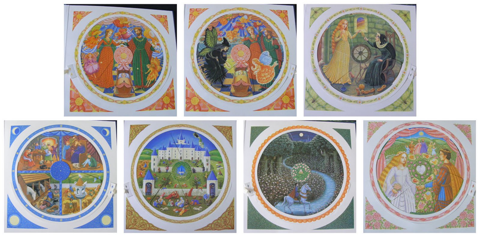
Disney are well known for their adaptations and "Disney Princesses". Over their long history they have adapted several of the most famous fairy tales, including:
  • Snow White and the Seven Dwarves, 1937
  • Cinderella, 1950
  • Sleeping Beauty, 1959
  • The Little Mermaid, 1989
  • Beauty and the Beast, 1991
  • The Princess and the Frog, 2009
  • Tangled, 2010


Disney have always been famed for their adaptations of fairy tales, although they have been controversial amongst some fairy tale fanatics. The stories are usually glammed up and with, as you might expect, happy endings. However, fans of the original Grimm tales often think the narratives have been cleaned up in order to better appeal to audiences, as many of the original stories contained violence, gore and sexual innuendos. These stories created some uproar when originally printed in 1812; people believed the stories were unsuitable for their child audience. This lead to some editorial changes surrounding the evil mothers (later to be known as step-mothers) and a pregnancy reference in Rapunzel to be cut. Despite this, it has been said that the violence, particularly towards villains was increased.

It is clear why Disney have re-written these narratives to create wholesome family viewing, with good morals. Obviously, controversy would not do the films good in terms of box office sales and ancillary products, which we know have made Disney millions over the years!

However, they have not always been free of controversy. Their 2009 release The Princess and the Frog was greeted with some negative press due to the supposed stereotyping of New Orleans black women, through the character of Tiana. Some felt strongly against the writing of a black character by white people. The film was also criticised by Christian groups and others for its use of Louisiana voodoo as a plot device.

Despite this lapse in customer support, the film received excellent reviews from critics and Disney is still as popular as ever! Although they have reportedly made their last fairy tale adaptation, Disney will continue to make noteworthy films for many years to come.

Monday 11 April 2011

Digital Films Sets

As I am looking to create a set of realistic scenes I have decided to look at a variety of films that use CGI techniques to help create their scenes. I have been able to get screenshots from each of these films from original DVDs of each film. I have chosen these as they are realistic, whether stylised or not, with scenes that I take inspiration from.

The first is Tim Burton's Alice in Wonderland (2010):

First Scene in Wonderland
This is the first scene inside Wonderland, and I love the alternate sense of scale; this changes throughout the film as Alice grows and shrinks and various stages in the plot. The image below is one that I particularly admire. The huge toadstools and their bright colours have such perfect detail that we are immediately drawn right in. This is an effect I desperately hope to create in my pieces.
Going to See Absolum

Which Way to the White Queen's Castle
The signpost above is the perfect example of an object that has been altered due to its position in a fantasy tale. I would like to create something similar in my work, as these quaint changes to real life give a fantasy scene another level that the audience can strongly relate to. I also like the attention to detail in terms of the texture of the tree, this is something I am going to have to strongly consider during my research and planning stages.
The Red Queen's Castle
The two castles in this story are very interesting to study, as they have strong reflections of their owners. The White Queen is pure and good hearted, her castle is white and powerfully structured; whereas, the Red Queen is evil and domineering, and so her castle is dark, overruling and dominant. I have also tried to get snapshots that demonstrate some element of perspective, either through a long distance or a clear sense of fore-, mid- and background; however, I will better focus on these elements at a later stage in my project.

The White Queen's Castle and Her Army

The next film I am going to look at is Harry Potter and the Goblet of Fire (2005):

First Scene Set - Graveyard
The Harry Potter series has become very iconic in this generation and is renowned for its impressive use of new cinema techniques, such as CGI. Due to the fantasy nature the narratives, the films have had to use high quality CG techniques in order to stick to their original plots as well as make them believable to the audience. As I am looking to create fantasy-style scenes, I hope to take something important from this research. By this stage in the series (Part 4) the digital techniques are well developed and almost seamless. I plan to take inspiration from these images whilst creating my own scenes.

Diving to Save What has been Lost
Above is a scene from the underwater section of the Triwizard Tournament. These scenes were filmed in a large purpose-built tank with a blue-screen background, allowing the scenery to be added later on in post-production. These scenes are quite revolutionary and certainly believable.
Fighting the Dragon
According to internet sources, there was at least one mechanical dragon constructed for this film, which could even breathe fire. However, most of the shots containing a dragon were created digitally, obviously these shots include the one below where harry is being chased through the air by a dragon. Once again these scenes are incredibly believable and fascinating to study.
Dragon Chase Through the Air
 I have also taken scenes from Tim Burton's Charlie and the Chocolate Factory (2005):

Mr Wonka and His Factory
Above is the first shot we get of the factory from the outside; and below, the first shot from the inside. The first room we see is very impressive and you can feel your own excitement growing from the magnificent treats inside. This scene could be considered quite similar to the forest is Alice in Wonderland, with the large mushroom-like structures and the strange and unusual objects spread around the room. However, I like the optimism created through the bright colours and strong lighting used. This has made me think about the mood and atmosphere I will need to set in my scenes. I must consider this, and how I will create that effect, carefully as it is very important to get it right.
First Room Inside the Factory

River Ride
The Oompa-Loompas can be seen in both of these images (above and below); they are quite different from the creatures designed in the original 1971 take on the book. These creatures were a feat of digital imaging all on their own. Each Oompla-Loompa in this film was played by the same person, actor Deep Roy, and digitally copied several (hundred?) times to create a whole flock of the creatures, each seeming slightly different from another.
Oompa-Loompas Down Garbage Shoot

Glass Elevator to the TV Room
The above scene is particularly interesting to me because I can see elements of matte painting. The dull blue/grey hue to the entire composition is very commonly seen in matte paintings, as it creates a very intreguing futuristic atmosphere. This is, of course, helped by the unusual objects that are hovering effortlessly in mid-air.
Final Scene

Thursday 7 April 2011

Initial Design Sketches

I have now created a range of rough designs for each of my chosen scenes. I will now evaluate each one to help me make decisions on how to better my ideas. Each of my drawings have been done to a rough scale of the door measurements I previously researched. Also see sketchbook for original drawings.

Hansel and Gretel
Design One                  Design Two
In the first design I have tried to incorporate as much detail as I could from the original story; for instance the white bird that lures the children, the ordinary bird(s) that eat the bread crumbs, the forest and the house. I like this idea as it is iconic and could be interesting to create, i.e. the food-based house. Design Two is very similar but I have created a composition that allows full view of the house. This could be advantageous if the house is designed properly, but the food-textures could be difficult to create.

Rapunzel
Design One            Design Two            Design Three
I am very excited about the Rapunzel representation. Of these designs my favourite is Design One; it has a strong focus on the tower with few distractions. This could help to create a very realistic image from the very start. However, Design Two is truer to the original narrative: the tower being in the centre of the forest. I must consider which direction to take: artistic vision or true to the story. This is an important decision I will consider through the early stages of my research. As I continue my research into my topics, I will gain a better idea of what I hope to create at the end of this project.

 The Three Billy Goats Gruff
Design One                      Design Two
I struggled to create a range of designs for this particular story. I liked Design One and found the story too simple to elaborate. Although I like Design One, I fear it is not quite clear enough that it is a representation of The Three Billy Goats Gruff, as there is little to include in the scene besides the bridge and the grassy hills. I am reluctant to put characters in the scene for complex reasons. I think adding a character will make the scene look quite static; whereas, I need a sense of movement to make the scene seem realistic.

These drawing have helped me to realise my aims, and have made me think about changing at least one of my stories. I am happy with this change in direction, as it is still early stages in the project and changes will always have to be made to help a project develop and evolve. Therefore, I will move on to my research into digital film scenes and adaptations of fairy tales. This may help me to consider other fairy tales.